How can we help your business grow?
Before we start any website build we take a look at your current website and do a full website audit on this including current ranking keywords, User Experience, website flow, page content, and website speed. We take a deeper look into how we can increase your website’s exposure to capture more leads or sales. This could be a combination of many things like a faster website, and more on-page content on product or service pages.
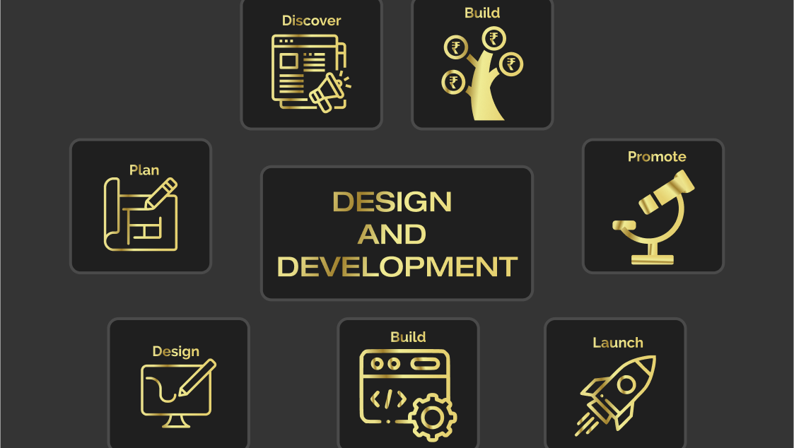
Design And Development
When someone visits your website you have second to capture their attention. We years of creating engaging websites that are designed to give an amazing user experience. The correct brading colour and images are important to your business, having colours that bounce of each other and pop to the end user.
SEO Friendly Websites
We create SEO friendly websites so you can hit the ground running once your new website is live, we know the importance of ranking highly for your products or services. Having an SEO friendly website is just the start of the journey but a carefully planned SEO strategy can take your website and business to the next level.
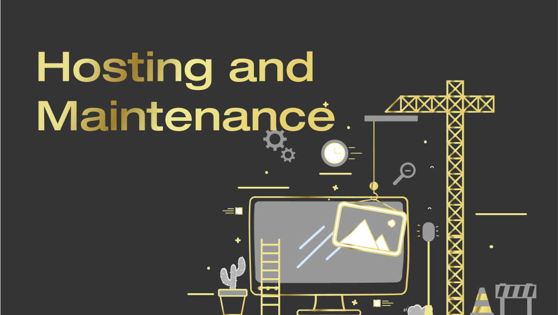
Hosting and Maintenace
Here at Web Design SEO we offer hosting and on going maintenance packages to suit every business and the size of their website. Our servers are from green energy and offer 99.9% up time. By having a reliable host ensures that your business stays live and encoures no down time.